Audrey Chu
Mathematical & inquisitive learner with an appetite to solve problems with data.
NASDAQ Stock Indices
March 2017 – Statistics 141B: Data and Web Technologies
Contributors: Jeremy Weidner, Weizhou Wang, Yuji Mori, and Audrey Chu
Abstract
To study NASDAQ stock prices for the technology, finance, health care, and energy industry sectors across time. With the application of python and utilization of the Yahoo! Finance API, Yahoo Query Language (YQL), and New York Times API, we will gather and clean out a dataset for a time period of ten years for approximately 1770 companies. Our data will incorporate the closing prices for each day and then average these prices for each respective sector. In analyzing the stock prices, we will use interactive data visualization as well as attempt to create a time series ARIMA (Autoregressive Integrated Moving Average) model.
Questions of Interest
- How do stock prices differ among industry sectors?
- Can we explain unusual trends in past prices by relating them to major historical events?
- Which month for which sector has the least volatility?
Table of Contents
- I. Data Extraction
- II. Snap Shot of the Data
- III. Data Visualization
- IV. Volatility Analysis
- V. Relevant News Articles from The New York Times and Stock Volatility
- VI. Time Series Analysis
# Yahoo YQL API
PUBLIC_API_URL = 'https://query.yahooapis.com/v1/public/yql'
OAUTH_API_URL = 'https://query.yahooapis.com/v1/yql'
DATATABLES_URL = 'store://datatables.org/alltableswithkeys'

def myreq(ticker, start, end):
    '''
    input ticker & dates as strings form 'YYYY-MM-DD'
    '''
    params = {'format':'json',
             'env':DATATABLES_URL}
    query = 'select * from yahoo.finance.historicaldata where symbol = "{}" and startDate = "{}" and endDate = "{}"'.format(ticker,start, end)
    params.update({'q':query}) # adds YQL query for historical data to parameters
    req = requests.get(PUBLIC_API_URL, params=params)
    req.raise_for_status()
    req = req.json()
    if req['query']['count'] > 0:
        result = req['query']['results']['quote']
        return result
    else:
        pass
def price2(ticker):
    """
    Return closing prices for stocks from years 2006 to 2016.
    """

    date=[]
    price=[]
    report = []

    years = [2006,2007,2008,2009,2010,2011,2012,2013,2014,2015,2016] # range of years to search for
    for x in range(len(years)): # have to iterate bc if over 364 items requested returns none
        c = myreq(ticker,'{}-01-01'.format(years[x]),'{}-12-31'.format(years[x]))
        try:

            for i in range(0,len(c)):
                date.append(pd.to_datetime(c[i]["Date"]))
                price.append(float(c[i][u'Close']))
                datef = pd.DataFrame(date)
                pricef = pd.DataFrame(price)
                table1 = pd.concat([datef,pricef],axis = 1)
                table1.columns = ['Date', ticker]
                table1 = table1.set_index("Date")

        except Exception:
            table1 = pd.DataFrame()

    return table1
I. Data Extraction
We begin by extracting our main dataset, which comes from the Yahoo Finance API. We extracted stock closing prices for each stock currently in the Nasdaq. We do this by supplying requests with a YQL query for the historical data table of the API. Not every stock currently in the Nasdaq was around from when we started extracting in 2006, so their values are NA until they IPO. The weights of these additions, when they happen, are not believed to be of substantial impact to our analysis of price because we aggregate over 4 sectors across roughly 1,700 stocks. If you look closely at the function, it iterates by year because if you request over 364 values, there is an undocumented error where you get returned an empty JSON object.
The list of companies on NASDAQ can be found here.
csv = pd.read_csv('./companylist.csv')
newcsv = csv[csv["Sector"].isin(["Finance", "Energy","Health Care","Technology"])].reset_index()
del newcsv["index"]
whole_list = newcsv['Symbol']
#code used to get the dataset. Took overnight.
"""
for l in whole_list:
    get = price2(l)
    try:
        df = pd.concat([df,get],axis = 1)    # concat. by column
    except NameError:
        df = pd.DataFrame(get)    # initialize automatically
# SAVE THE RESULT LOCALLY:
df.to_pickle('mydf')
"""
print()
df = pd.read_pickle('mydf')
final = newcsv.reset_index()
df_long = df.transpose()
sector  = final[['Symbol','Sector']]
sector = sector.set_index('Symbol')
final = df_long.join(sector)
# Take median of each group for recorded date
med_sector = final.groupby('Sector').median().reset_index('Sector')
med_sector = med_sector.set_index('Sector')
med_sector = med_sector.dropna(thresh=4, axis = 1)        # Drop if a column less than two non-NAs
# Dates as index for plotting
# Columns are now the Sector medians
med_T = med_sector.transpose()
II. Snap Shot of the Data
med_T.head()
| Sector | Energy | Finance | Health Care | Technology |
|---|---|---|---|---|
| 2006-01-03 00:00:00 | 13.565 | 23.250000 | 6.945685 | 11.245 |
| 2006-01-04 00:00:00 | 13.460 | 23.309999 | 6.925000 | 11.655 |
| 2006-01-05 00:00:00 | 13.750 | 23.459999 | 6.990000 | 11.770 |
| 2006-01-06 00:00:00 | 13.700 | 23.400000 | 7.019992 | 11.775 |
| 2006-01-09 00:00:00 | 13.790 | 23.500000 | 7.100000 | 12.050 |
Above is the .head() of our final dataframe. Indexed by date from 2006 to 2016, the dataframe contains the median closing prices across all NASDAQ companies grouped by sector. Note that prices have minimal changes across consecutive days, as expected. It would be unusual to see a price change of more than 1.0 in one day. To further investigate the stock price changes in the last decade, we decided to produce visual diagnostics.
III. Data Visualization
3.1 Interactive Price Plot on Energy
Above is one example of an interactive time series slider plot for the Energy sector. Closing prices are highest in May 2007 at $25.56 whereas loweset closing price is at $3.49 in February 2016. This plot allows to look further into detail. Using the buttons as provided, we can pinpoint the exact day with the highest and lowest prices. The highest price is actually at $25.71 occurs on on May 15, 2007 and the lowest price occurs at $2.93 on February 10, 2016 and February 16, 2016. Additionally, looking at the plot by year, 2008 had the highest drop in stock prices. This drop is reasonably expected, as it aligns with the Recession of 2008. There is also a noticable drop in 2014 and 2015; however, an explanation behind these years is not as clear as that of 2008.
For that reason, let’s try some more plots.
3.2 Prices of all sectors
Above is an overlaid interactive plot with closing price data for all four sectors. Other sectors seem to be consistent with Energy sector between the years 2008 and 2010. The Energy sector differs the most from other sectors in terms of variation. Specifically, when looking between May 2008 and November 2008, the Energy sector is somewhat bimodal, with the first peak in July 2008 and second in October 2008. In contrast, the other three sectors remain consistent with their closing prices.
This peaks the question: what happened in this time period that the Energy sector was specifically affected? We already expect all stock prices to drop signficantly during the recession, but why are there sector-specific or unusually inconstitent fluctuations. To accurately measure these flucations relative to sector, we need to normalize the changes through volatility analysis.
IV. Volatility Analysis
# New dataframe for the difference between each day as a percentage
delta_df = pd.DataFrame()
for sect in med_T.columns:
    delta_df[sect] = np.log(med_T[sect].shift(1)) - np.log(med_T[sect])
delta_df.columns = map(lambda name: '{} Changes'.format(name),med_T.columns)
A more accurate representation to measure trends or changes in sector is to take the difference of closing prices for each day. This will show the percentage change in price relative to the previous day. Mathematically this is,
<center>$growth_t = \frac{price_{t+1} - price_t}{price_t}$   or   $increase_t = \frac{price_{t} - price_{t-1}}{price_t}$</center>

The formulas above measure the differences but can lead to differing conclusions.  The most efficient way to model the growth of the stock is through log differences,
<center>$change_t = log(price_t) - log(price_{t-1})$</center>

where $price_t$ represents the median closing price at time t for a sector.  Log differences are advantageous because they can be interpreted as the percentage change in a stock price and they do not depend on the fraction denominator.
# Stock price spike the most?
abs(delta_df).idxmax()
Energy Changes        2008-10-06
Finance Changes       2008-12-01
Health Care Changes   2008-11-19
Technology Changes    2008-12-01
dtype: datetime64[ns]
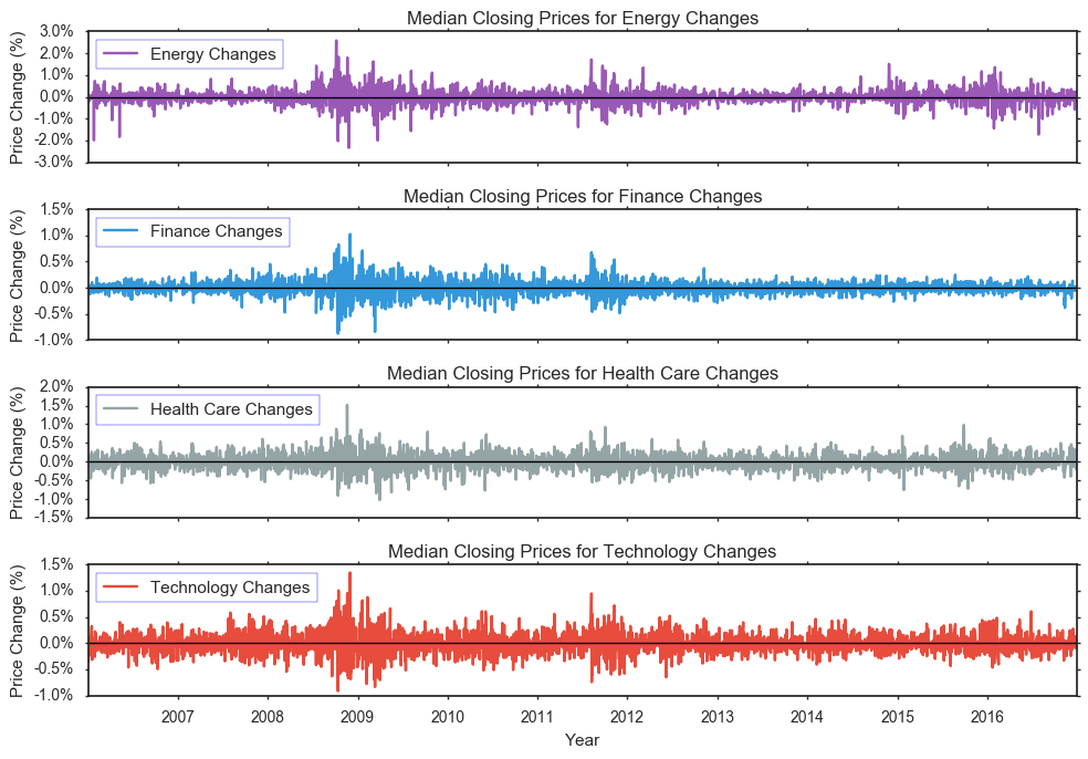
You’ll notice that for all sectors, the biggest changes in closing prices occur between 2008 and 2010, which supports our initial comments. However, by looking at the changes rather than actual prices, this plot shows that there is on average changes average between -1.0% and +1.5%, with the exception of Energy’s changes ranging from -3.0% and +3.0%. This provides better insight to how much change occurs in relation to former price trends.
Additionally, we see that the highest absolute value of price change for Energy occurred on October 6, 2008, for Finance occurred on December 1, 2008, for Health Care occurred on November 19, 2008, and for Technology occurred on December 1, 2008. 2008 is clearly an interested period because of the recession and these extremes or maximum of price changes prove that. All maximums are located withing a few months of each other, and interestingly enough, Finance and Technology actually have maximums on the same day.
Although direction of changes are consisten across sectors, Energy seems to always have the highest volatility. Higher volatility in Energy is due to the sector’s large portion of business in commodities market including oil, minerals, and wood. Specifically, the sector consists of monopolies and oligopolies that have higher pricing power since they are the sole sellers. The slow adjustment caused by the supply and demand rule are not are pronounced in this specific sector.
4.1 Periods of Interest for Major Price Changes
In addition to the 2008 Recession, we want to know what other periods in the past ten years had extreme or unusual behavior. Here, we take the average using months (rather than days) as units to obtain a more global or broader view of changes.
med_T.index= pd.to_datetime(med_T.index)
avg_month = med_T.groupby([med_T.index.year, med_T.index.month]).mean()
avg_month.head()
| Sector | Energy | Finance | Health Care | Technology | |
|---|---|---|---|---|---|
| 2006 | 1 | 14.183000 | 23.605500 | 7.159611 | 11.686500 |
| 2 | 15.404737 | 23.857619 | 7.334495 | 11.895263 | |
| 3 | 14.699130 | 23.953911 | 7.656957 | 12.523913 | |
| 4 | 15.968421 | 23.920786 | 7.665814 | 13.029474 | |
| 5 | 17.850000 | 23.418863 | 7.096370 | 12.887273 |
# DF for the difference between each month's average:
delta_avg = pd.DataFrame()

for sect in avg_month.columns:
    delta_avg[sect] = np.log(avg_month[sect].shift(1)) - np.log(avg_month[sect])
delta_avg.columns = map(lambda name: '{} Changes'.format(name),avg_month.columns)

col = []
for i in range(len(delta_avg)):
    dt = delta_avg.index[i] + (10, 10, 10, 10)
    dt_obj = datetime(*dt[0:6])
    col.append(pd.to_datetime(dt_obj))
delta_avg['Timestamp'] = col
delta_avg = delta_avg.set_index('Timestamp')
(abs(delta_avg).iloc[1:,:].quantile(q=0.90, axis=0))
Energy Changes         0.163191
Finance Changes        0.059207
Health Care Changes    0.118481
Technology Changes     0.084176
dtype: float64
peak = delta_avg[(abs(delta_avg) >= 0.163191).any(axis=1)]
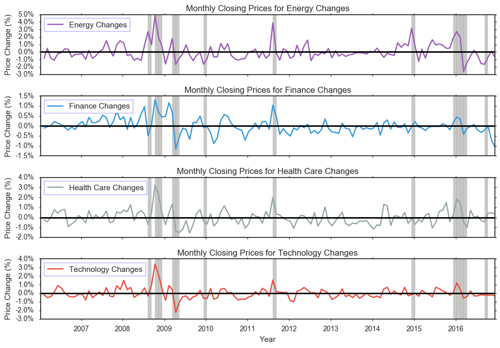
On a larger scale, looking at average changes per month, we see that range of changes now differ more between sectors. Specifically, the range of changes for Technology is now between -3.0% and 4.0%. This tells us that on a monthly average, changes are bigger than that of days. Even looking at prices based on monthly averages, we see that Energy still has the biggest change from -3.0% to 5.0%.
Let’s try to see what happens in other sectors during periods of high volality of any sector. Our threshold here will be the 90th percentile of absolute value of changes as shown below. We will take the highest of these values to be more inclusive. The periods of high volatility are shaded above. In addition to the years between 2008 and 2010, the year 2016 also has unusualy behavior. There is a signficant drop in average monthly price change for the Energy sector. Looking at the plots below it, we see that there is a similiar pattern with other interests. The smallest drop during this 2016 time period is for the Finance sector.

4.2 Best months to invest
abs_delta_df = abs(delta_df)
months = abs_delta_df.groupby(delta_df.index.month).sum()
months["total"] = months.sum(axis=1)
sns.set_style("white")
sns.set_context({"figure.figsize": (20, 10)})
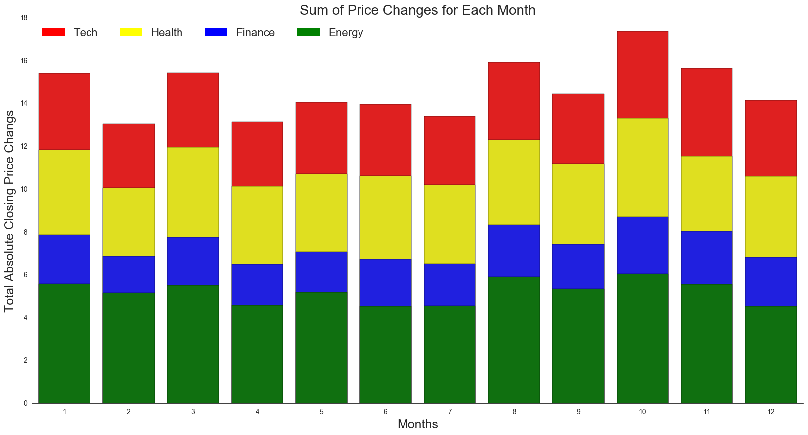
It turns out overall, October (month 10) has the highest total sum of changes. We see a generally lower sum from February to July. As for specific sectors, there is a similar pattern across months. Februrary has the lowest sum of changes per sector and overall. This can be explained with a seasonal trend of variation.
“The aggressive selling of stock losers generally sets up the market for a yearly low in the October time period. Historically, October has a greater percentage of correction and bear-market bottoms than any other month.” - Money US News
Additionally, we see that the next highest total changes occur during January (month 1) and August (month 8), which are typically the fourth or first quarter. This can be explained with workers having a little extra money to invest in. Year-end bonuses tend to go right into the stock market, which increases cash inflows, stock buying and thus drives the market higher.
Lastly, with the tax deadline on April 15, we would expect more volatility in the month of March since investors might be scrambling to fund their indivudal retirement accounts, injecting capital into the equity market.
V. Collecting Relevant News Articles from The New York Times
Objective: Provide context to our time series plots and make historically accurate inferences about the data.
The New York Times Article Search API is capable of extracting decades worth of news records. We utilized the API in order to extract over 9,000 relevant articles, filtered by the four designated sectors. To visualize the data, we have developed an interactive plot.ly timeline that allows users to navigate a 10-year period’s worth of news headlines.
# OLD KEY (hit my limit): api = articleAPI('2679a66fe8df4740b754f98e52ad068c')
api = articleAPI('e031fcaf03da4b3c949e505c4aa69a5b')
def news_articles(sector,start,end,pages):
    sector_df = pd.DataFrame()
    for i in range(pages):
        try:
            if sector == 'Health Care':
                sector_articles = api.search(
                    q = 'Health',
                    fq = {
                        'news_desk':'Business',
                        'section_name':'Business',
                        'subject.contains':['Health','Drugs'],
                        'type_of_material':'News'
                    },
                    begin_date = start,
                    end_date = end,
                    sort = 'oldest',
                    page = i
                )
            if sector == 'Technology':
                sector_articles = api.search(
                    fq = {
                        'news_desk.contains':'Business',
                        'section_name':'Technology',
                        'subject.contains':['Acquisitions'],
                        'type_of_material':'News'
                    },
                    begin_date = start,
                    end_date = end,
                    sort = 'oldest',
                    page = i
                )
            if sector == 'Energy':
                sector_articles = api.search(
                    q = 'Energy & Environment',
                    fq = {
                        'news_desk':'Business',
                        'subject.contains':['Energy','Renewable','Gas','Acquisitions'],
                        'section_name':'Business',
                        'type_of_material':'News'
                    },
                    begin_date = start,
                    end_date = end,
                    sort = 'oldest',
                    page = i
                )
            if sector == 'Finance':
                sector_articles = api.search(
                    q = 'Finance',
                    fq = {
                        'news_desk':'Business',
                        'subject.contains':['Banking','Financial'],
                        'section_name':'Business',
                        'type_of_material':'News'
                    },
                    begin_date = start,
                    end_date = end,
                    sort = 'oldest',
                    page = i
                )
            df_i = sector_articles['response']['docs']
            sector_df = sector_df.append(df_i)
            time.sleep(0.5)   # API only allows 5 calls per second. This slows it down!
        except KeyError:
            break
        except IndexError:
            break
    return sector_df.reset_index()
Important Notes:
Asking for over 100 pages at once (necessary for a 10-year span) leads to unpredictable results.
- Ideally I would extract news articles using the following call:
news_articles(<sector>,20060101,20170101,500), but the function stops running around 110~120 pages. This is likely due to usage restrictions imposed by the API. - My solution: Split the desired time frame, make separate calls, concatenate the results, save locally
- Even with this work-around, it took multiple tries to obtain the correct result.
###The following code locally stores the news data. Please do not run this block!

"""
healthcare_news1 = news_articles('Health Care',20060101,20091231,100)
healthcare_news2 = news_articles('Health Care',20100101,20131231,100)
healthcare_news3 = news_articles('Health Care',20140101,20161231,100)
healthcare_news = pd.concat([healthcare_news1,healthcare_news2,healthcare_news3],ignore_index=True)
healthcare_news['Sector'] = 'Health Care'
tech_news = news_articles('Technology',100)
tech_news['Sector'] = 'Technology'
energy_news1 = news_articles('Energy',20060101,20091231,100)
energy_news2 = news_articles('Energy',20100101,20131231,100)
energy_news3 = news_articles('Energy',20140101,20161231,100)
energy_news = pd.concat([energy_news1,energy_news2,energy_news3])
energy_news['Sector']='Energy'
finance_news1 = news_articles('Finance',20060101,20091231,100)
finance_news2 = news_articles('Finance',20100101,20131231,100)
finance_news3 = news_articles('Finance',20140101,20161231,100)
finance_news = pd.concat([finance_news1,finance_news2,finance_news3])
finance_news['Sector']='Finance'
all_news = pd.concat([healthcare_news,tech_news,energy_news,finance_news],ignore_index=True)
all_news.to_pickle('news_df')
"""
print()
all_news = pd.read_pickle('news_df')
# Convert dates to index
all_news['pub_date'] = pd.to_datetime(all_news.pub_date)
all_news = all_news.set_index('pub_date',drop=True)
print("Dimensions of the DataFrame: "+str(all_news.shape))
print("All Column Names: \n" +str(all_news.columns))
all_news.head()
Dimensions of the DataFrame: (6749, 21)
All Column Names:
Index([           u'Sector',               u'_id',          u'abstract',
                    u'blog',            u'byline',     u'document_type',
                u'headline',             u'index',          u'keywords',
          u'lead_paragraph',        u'multimedia',         u'news_desk',
              u'print_page',      u'section_name', u'slideshow_credits',
                 u'snippet',            u'source',   u'subsection_name',
        u'type_of_material',           u'web_url',        u'word_count'],
      dtype='object')
Printed above: The data frame .head() containing results of every API query.
Each query returns a page of 10 news articles based on the specified set of search parameters. All articles were selected from the “Business” News Desk of the New York Times, though the rest of the terms supplied were generally unique to each sector. Selecting these keywords proved to be particularly tedious; a permissive query would return news and advertisements that have no relevance to the stock market, while a highly selective query would yield too little results. Our results contain a total of 6749 items spanning a course of 11 years, or an average of about 614 items per year. The articles are not evenly distributed between all sectors.
All 21 components of the query result are included in the master data frame above for illustrative purposes. The information used in our final analysis is listed below.
pub_date(converted to index)Sectorheadlineweb_url
headlines = [d.get('main') for d in all_news.headline]
dates = all_news.index.values
# Pandas categorical objects have integer values mapped to them:
sector_levels = all_news['Sector'].astype('category').cat.codes

# Data Frame for plot.ly Timeline:
pltdf = pd.DataFrame(
    {'Date':dates,
     'Title':headlines,
     'Sector':all_news.Sector,
     'Level':sector_levels
    })
5.1 Timeline of the News
import plotly.plotly as py
import plotly.graph_objs as go

fig = {
    'data': [
        {
            'x': pltdf[pltdf['Sector']==sector]['Date'],
            'y': pltdf[pltdf['Sector']==sector]['Level'],
            'text': pltdf[pltdf['Sector']==sector]['Title'],
            'name': sector, 'mode': 'markers',
        } for sector in reversed(all_news['Sector'].astype('category').cat.categories)
        ]
    }
py.iplot(fig, filename='plotly_test')
The Timeline
To reiterate, the articles found in this tool are primarly from the Business category of the NYT API to ensure that the majority of the headlines have a high relevance to the stock market indicies we analyzed. At the same time, the news encompasses a wide array of contexts (legislation, judicial processes, company mergers and acquisitions, international events, R&D, and others). Even company-specifc headlines usually target the largest corporartions within their respective industries.
Use the zoom and scrolling options on this interactive plot to see the results in more detail.
5.2 Analysis of Vocabulary during Periods of High Volatility
Though the timeline is a cool concept, its scope is too wide to make any substantial conclusions. To further our analysis on average stock prices, we return to the volatility plots, specifically focusing on the shaded regions of highest volatiliy.
From these time periods, we analyzed the text body from the articles in the timeline to calculate word frequencies. The top 10 words were plotted on a frequency chart, and the top 100 words from each sector were selected and displayed on a word cloud.
** How did we do it?**
One problem was that the NYT API does not provide the full body of each article; the most it provides is one complete sentence. However, it did provide us with a direct URL to the article. The solution was clear: bust out BeautifulSoup and scrape the HTML pages themselves. Each article body was combined into one large corpus for each sector. From here, we processed the text using NLTK to obtain frequency measurements. The plots were generated using standard matplotlib and seaborn libraries as well as wordcloud.
We have visualized two periods where the volatility persisted for an exceptional length:
- 8/2008 to 11/2008
- 12/2015 to 3/2016
tokenize = nltk.word_tokenize
def stem(tokens,stemmer = PorterStemmer().stem):
    return [stemmer(w.lower()) for w in tokens]
# http://stackoverflow.com/questions/11066400/remove-punctuation-from-unicode-formatted-strings
def remove_punctuation(text):
    return re.sub(ur"\p{P}+", "", text)
# Extract text from a NYT news article URL:
def url_text(url):
    #doc = urlopen(url)
    # Must override HTTP redirects...
    # SOURCE: http://stackoverflow.com/questions/9926023/handling-rss-redirects-with-python-urllib2
    doc = urllib2.build_opener(urllib2.HTTPCookieProcessor).open(url)
    soup = BeautifulSoup(doc, 'html.parser')
    tags = soup.body.find_all('p',{"class":"story-body-text story-content"})
    corpus = []
    for tag in tags:
        corpus.append(tag.text.strip())
    corpus =' '.join(corpus)
    return(corpus)
# Create a corpus which contains text from all articles in the sector
def sector_corpus(data):
    '''
    requires dataframe input (a subset by date of all_news).
    Outputs one large string from every URL found in in the dataframe.
    '''
    links = data.web_url
    full_sector = []
    for link in links:
        try:
            full_article = url_text(link)
        except:
            full_article = ''
        full_sector.append(full_article)
    return(' '.join(full_sector))
# Process the text and return a dictionary of term:frequency
def BetterClouds(data):
    '''
    Applies the sector_corpus() function and returns the top 100 words from said corpus.
    '''
    text = sector_corpus(data)
    text = text.lower()
    text = remove_punctuation(text)
    tokens = tokenize(text)
    ignore = ['said','say','$','like','also','like','or','would']
    filtered = [w for w in tokens if not w in stopwords.words('english')+ignore]
    filtered = stem(filtered)
    count = Counter(filtered)
    # top 100 words:
    top_words = dict(count.most_common(100))
    return(top_words)
    #cloud = wordcloud.WordCloud(background_color="white")
    #wc = cloud.generate_from_frequencies(top_words)
    #return(wc)
# (1) Subset the data:
sample1 = all_news['2008-8-10 10:10:10':'2008-11-10 10:10:10']
sample1_sector = sample1.groupby("Sector")  # a groupby object
# (2) Subset the data:
sample2 = all_news['2015-12-10 10:10:10':'2016-03-10 10:10:10']
sample2_sector = sample2.groupby("Sector")
# List of dictionaries with term:frequency for each sector.
# NOTE: This takes an eternity to run (scraping and processing hundreds of pages).
# These lists have been saved locally as 'termfreq_2008' and 'termfreq_2016' respectively.

# ORIGINAL CODE:
# word_freq_list = [BetterClouds(sample1_sector.get_group(sect)) for sect in all_news.Sector.unique()]
# word_freq_list2 =[BetterClouds(sample2_sector.get_group(sect)) for sect in all_news.Sector.unique()]

# SAVE LISTS LOCALLY:
#with open('termfreq_2008', 'wb') as fp:
    #pickle.dump(word_freq_list, fp)
#with open('termfreq_2016', 'wb') as fp:
    #pickle.dump(word_freq_list2, fp)
# Load the already-processed results for quick access.
with open ('termfreq_2008', 'rb') as fp:
    word_freq_list = pickle.load(fp)
with open ('termfreq_2016', 'rb') as fp:
    word_freq_list2 = pickle.load(fp)
# Create frequency bar plots for the news articles found in Aug2008--Nov2008.
#sns.set_style("dark")
for counter,sector in enumerate(word_freq_list):
top10 = sorted(sector.items(), key=lambda kv: kv[1], reverse=True)[:10]
terms,frequency = zip(*top10)
current_sect = all_news.Sector.unique()[counter]
plt.figure(counter,figsize=(6,3))
freq_plot = sns.barplot(terms,frequency,palette='GnBu')
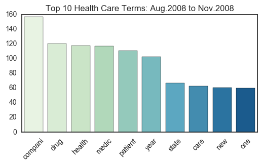
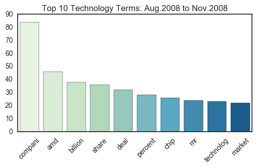
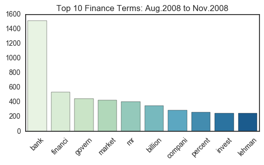
freq_plot.set_title("Top 10 %s Terms: Aug.2008 to Nov.2008"%current_sect)
for item in freq_plot.get_xticklabels():
item.set_rotation(45)

# Support the frequency plot with a word cloud.
fig = plt.figure(figsize=(20,10))
fig.suptitle("NYT Most Used Terms: Aug.2008 to Nov.2008", fontsize=30)
cloud = wordcloud.WordCloud(background_color="white")
for counter, sect in enumerate(word_freq_list):
    current_sect = all_news.Sector.unique()[counter]
    wc = cloud.generate_from_frequencies(sect)
    ax = fig.add_subplot(2,2,counter+1)
    ax.set_title("%s Sector" %current_sect,fontsize=20)
    plt.imshow(wc,aspect='auto')
    plt.axis("off")
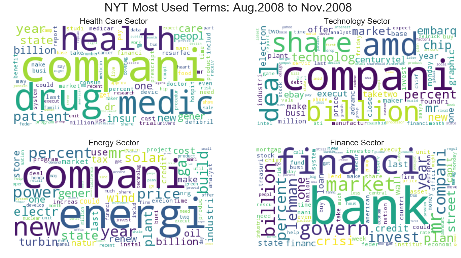
Note: The plotted terms are stemmed to omit any possible duplicates in the analysis.
Each sector has several key words that dominate their respective domains. Because these articles were originally collected using certain search parameters for the New York Times API, some terms (i.e. the sector names themselves) are unfortunately overrepresented. However, this design did not prevent other terms from taking the number one spot on the frequency plots. For example, “bank” tops the Financial plots with almost triple the frequency of the second most common term.
Notably, there are very few instances of term overlap. For example, it is clear that “compani” (assumably “company”) is a commonly used word in articles from all sectors. Aside from this instance, it can be argued that the news articles from each sector are unique and distinguishable in their vocabulary.
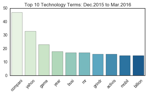
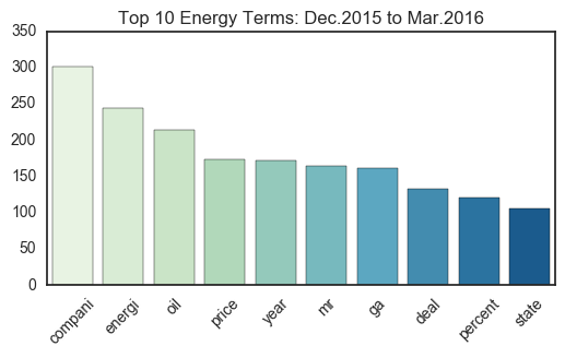
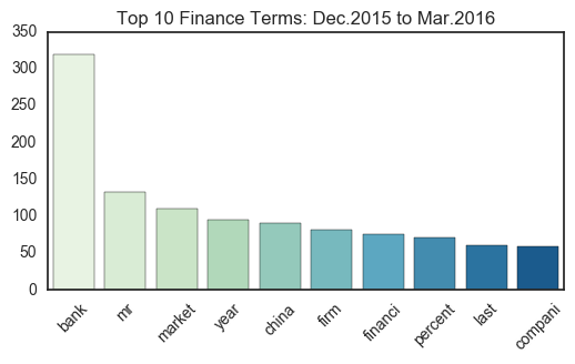
# Create frequency bar plots for the news articles found in Dec2015--Mar2016.
for counter,sector in enumerate(word_freq_list2):
top10 = sorted(sector.items(), key=lambda kv: kv[1], reverse=True)[:10]
terms,frequency = zip(*top10)
current_sect = all_news.Sector.unique()[counter]
plt.figure(counter,figsize=(6,3))
freq_plot = sns.barplot(terms,frequency,palette='GnBu')
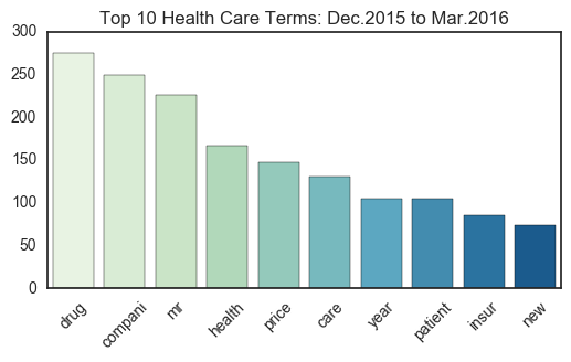
freq_plot.set_title("Top 10 %s Terms: Dec.2015 to Mar.2016"%current_sect)
for item in freq_plot.get_xticklabels():
item.set_rotation(45)
# Support the frequency plot with a word cloud.
fig = plt.figure(figsize=(20,10))
fig.suptitle("NYT Most Used Terms: Dec.2015 to Mar.2016", fontsize=30)
cloud = wordcloud.WordCloud(background_color="white")
for counter, sect in enumerate(word_freq_list2):
    current_sect = all_news.Sector.unique()[counter]
    wc = cloud.generate_from_frequencies(sect)
    ax = fig.add_subplot(2,2,counter+1)
    ax.set_title("%s Sector" %current_sect,fontsize=20)
    plt.imshow(wc,aspect='auto')
    plt.axis("off")
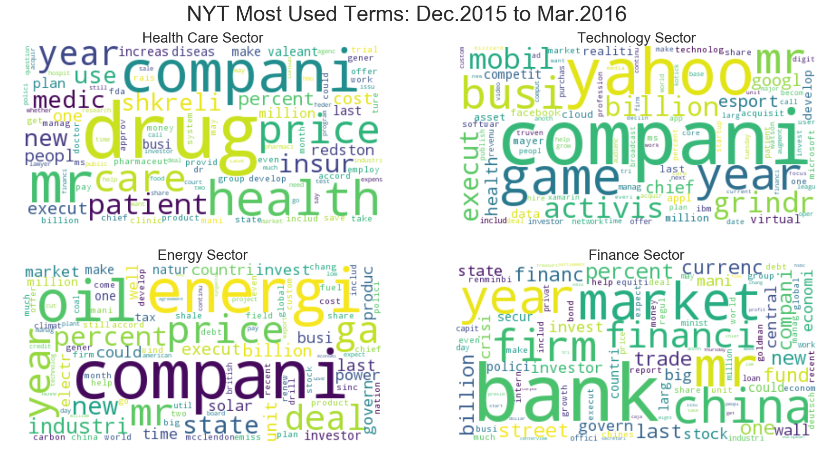
Some observable differences exist between the first set (2008) and the second set (2015-2016).
Though the most used terms remain more or less the same, a noticable change in vocabulary occurs in the Technology sector. For one, more companies are named explicity, with Yahoo and Grindr taking spots in the top 10 (on the word cloud, companies like Google and Apple make an appearance as well). In addition, the terms on this 2015-2016 word cloud seem to exclude “business terms” such as “share”,”deal”,and “market”, all of which were in the top 10 of the 2008 articles.
Yet for the other sectors, many of the major terms remain the same; “compani” remains in the first or second spot for Health Care, Tech, and Energy, and “bank” continues to dominate Finance. Thus, the terms that convey the most information likely exist somewhere in between the top 10 to 100 unigrams collected, as words like “game” and “esport” become more popular the Tech industry, and entities like China make their way into financial news. Overall, though the difference here is only a few years, the changes in term frequency may correspond to a shift in industry interests.
VI. Next step: Time Series Analysis
ts_eng = delta_df['Energy Changes']
# Why do we get an NA for Nov 1 2016?
# Need to change following date range
# ts_eng['2016-11-02':'2017-03-01']
Check Stationarity for Energy Sector
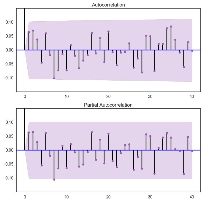
We suggust the next step for predicting future price is to check stationarity. For sure, the stock price is not stationary. We first tried to transform the data with log, and plot out ACF and PACFs. However, even after transforming, the data is still not stationary. To furthur understand the data, we performed Dickey-Fuller Test and plot out the results.
Complicated model will be used if one wants to predict stock price. But our project will just leave it here and everyone is welcome to continue the work.
from statsmodels.tsa.stattools import adfuller
def test_stationarity(timeseries):

    #Determing rolling statistics
    rolmean = pd.rolling_mean(timeseries, window=12)
    rolstd = pd.rolling_std(timeseries, window=12)

    #Plot rolling statistics:
    orig = plt.plot(timeseries, color='blue',label='Original')
    mean = plt.plot(rolmean, color='red', label='Rolling Mean')
    std = plt.plot(rolstd, color='black', label = 'Rolling Std')
    plt.legend(loc='best')
    plt.title('Rolling Mean & Standard Deviation')
    plt.show(block=False)

    #Perform Dickey-Fuller test:
    print('Results of Dickey-Fuller Test:')
    dftest = adfuller(timeseries, autolag='AIC')
    dfoutput = pd.Series(dftest[0:4], index=['Test Statistic','p-value','#Lags Used','Number of Observations Used'])
    for key,value in dftest[4].items():
        dfoutput['Critical Value (%s)'%key] = value
    print(dfoutput)
testE = delta_df["Energy Changes"]
E_log = np.log(med_T.iloc[-365:,:]['Health Care'])
E_log_diff = E_log - E_log.shift()
plt.plot(E_log_diff)
[<matplotlib.lines.Line2D at 0x117c68bd0>]
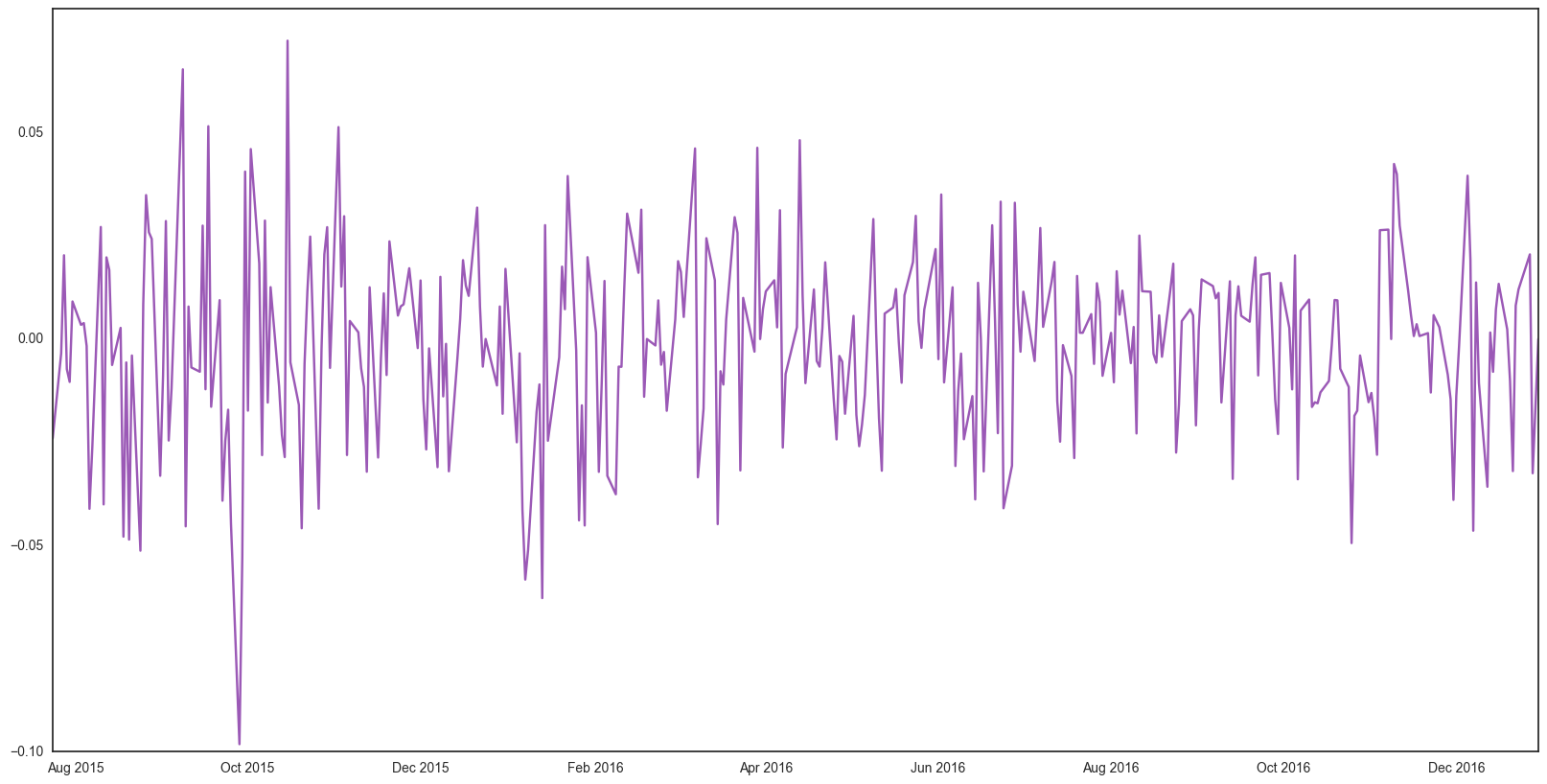
fig = plt.figure(figsize=(8,8))
ax1 = fig.add_subplot(211)
fig = sm.graphics.tsa.plot_acf(E_log_diff[1:].values.squeeze(),lags = 40,ax=ax1)
plt.ylim([-0.15,0.15])
ax2 = fig.add_subplot(212)
fig = sm.graphics.tsa.plot_pacf(E_log_diff[1:],lags =40, ax= ax2)
plt.ylim([-0.15,0.15])
(-0.15, 0.15)
import warnings
warnings.simplefilter(action = "ignore", category = FutureWarning)
E_log_diff.dropna(inplace=True)
test_stationarity(E_log_diff)
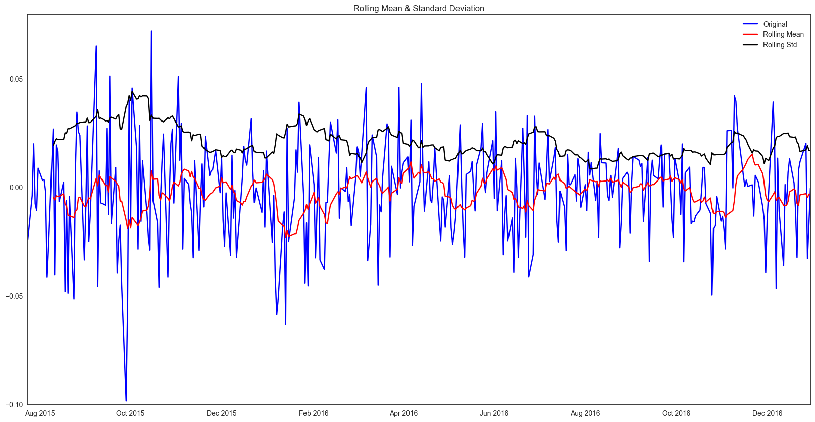
Results of Dickey-Fuller Test:
Test Statistic                -1.783212e+01
p-value                        3.130286e-30
#Lags Used                     0.000000e+00
Number of Observations Used    3.630000e+02
Critical Value (5%)           -2.869535e+00
Critical Value (1%)           -3.448494e+00
Critical Value (10%)          -2.571029e+00
dtype: float64